 This was a super exciting opportunity to work with a wide ranging team consisting of executive level management, fitness professionals, graphic designers, and marketing staff to create an architectural representation of a brand that would be rolled out in multiple locations.
Z4, or Zone 4, is a small group fitness training concept whose name references the 4th of 5 zones in heartrate based training. This 4th zone is thought to be an especially efficient place to train resulting in maximum fitness in the minimum amount of time. That said, it is typically represented in an orange color in heart rate graphics and that became the jumping off point for the project. The image below shows some of the early concept sketches.
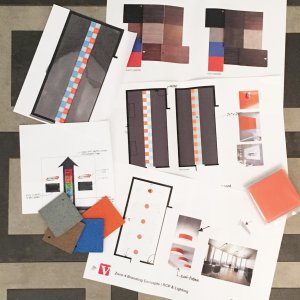
Any good architectural brand has key elements that can be replicated in each location. In the case of Z4, ultimately there were 7 items, each with a different level of hierarchy.
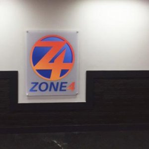
1. The logo. Any well branded space should have a great logo displayed loud and proud. Vibe collaborated with the signage vendor and the result was the frosted acrylic on stand offs.
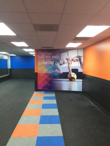
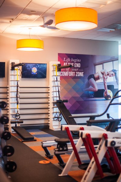
2. Graphic floor element. This was both functional as exercises would be performed here as well as aesthetic. It also helped keep cost down by adding a lot of interest while allowing the rest of the floor to black rubber which is significantly less expensive than colored rubber.
3. The graphic wall. I standardized paint colors and have accent color options….but nothing pops more than a graphic wallcovering. Vibe worked closely with the graphics team to select the image, quote, pattern and pattern colors. Love the way this turned out!
4. Decorative orange lights. In many of the spaces that would be retrofitted into these small studios, the ceilings were downright blah. Adding these bright orange lights reinforces the color scheme while distracting the eye from the plain Jane ACT ceilings. With both a ceiling mount and pendant version, a variety of ceiling heights can be addressed.
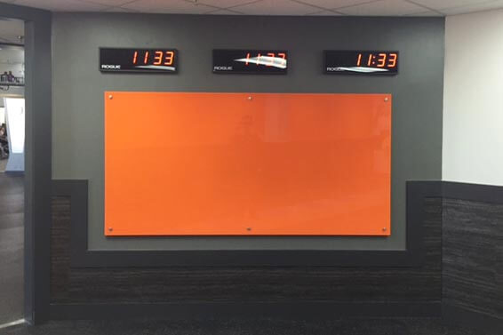
5. Orange glass board. Move over white boards! There is a new player in town! These glass boards are stylish, can take center stage and add to the design verses detracting from it. Plus they never ghost! In the case of Z4, this is a community building board where member stats or congrats can be given, inspirational thoughts can be shared, etc.
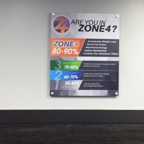
6. The heart rate graphic. In short, this is an informational graphic designed to complement the space. It explains why they are doing what they are doing to new members.
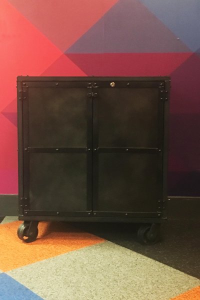
7. The cabinet. The program needed a small locking cabinet to keep equipment in and we decided to make it rolling so they could place it outside the studio door with promotional material on top. (These studios are all located inside larger health club facilities.) After searching the internet to no avail, I turned to Etsy and had them custom made. Not only do they compliment the design but they were a reasonable price, exactly what the client needed, and we were able to support small business. Score!
Once these elements were finalized, there was still design work involved as they need to be carefully overlayed in each new studio. This can be tricky, especially in a retrofit situation. Vibe understands the hierarchy of these branding elements and places them accordingly while looking at circulation, equipment layout and other functional needs.
The end result? Energetic super fun space to get your sweat on! To see some shots of finished space with the equipment loaded, click here.